
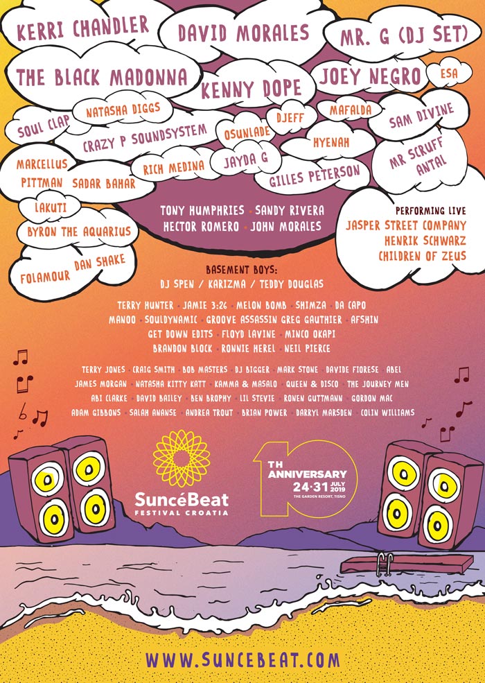
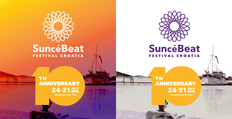
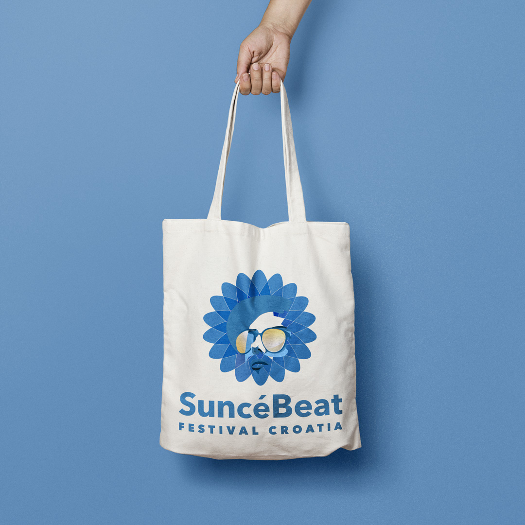
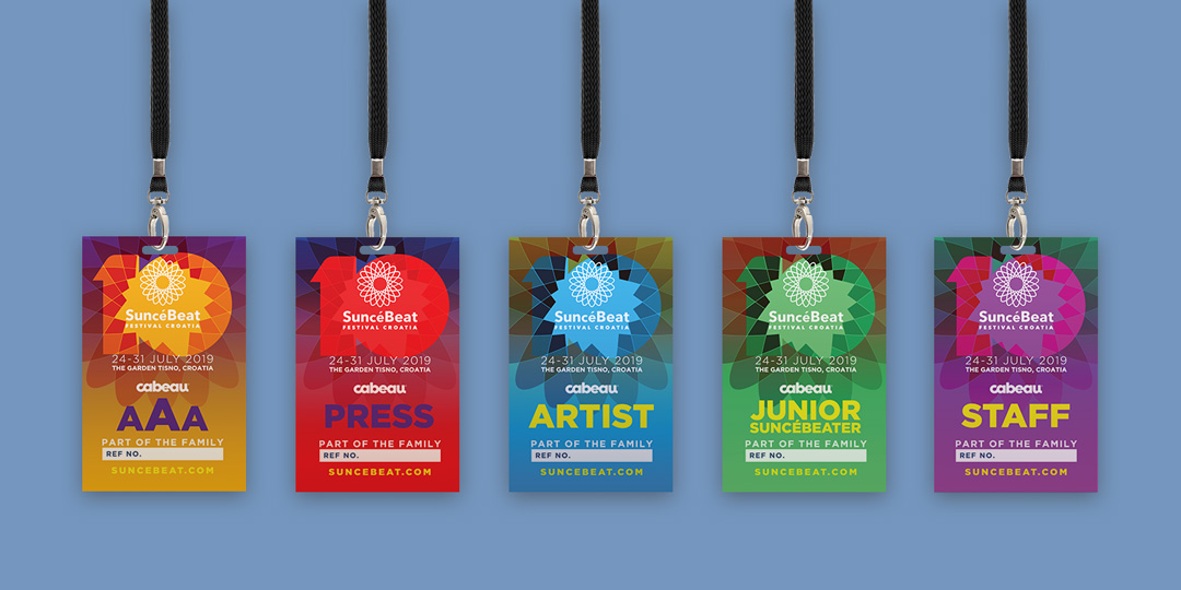
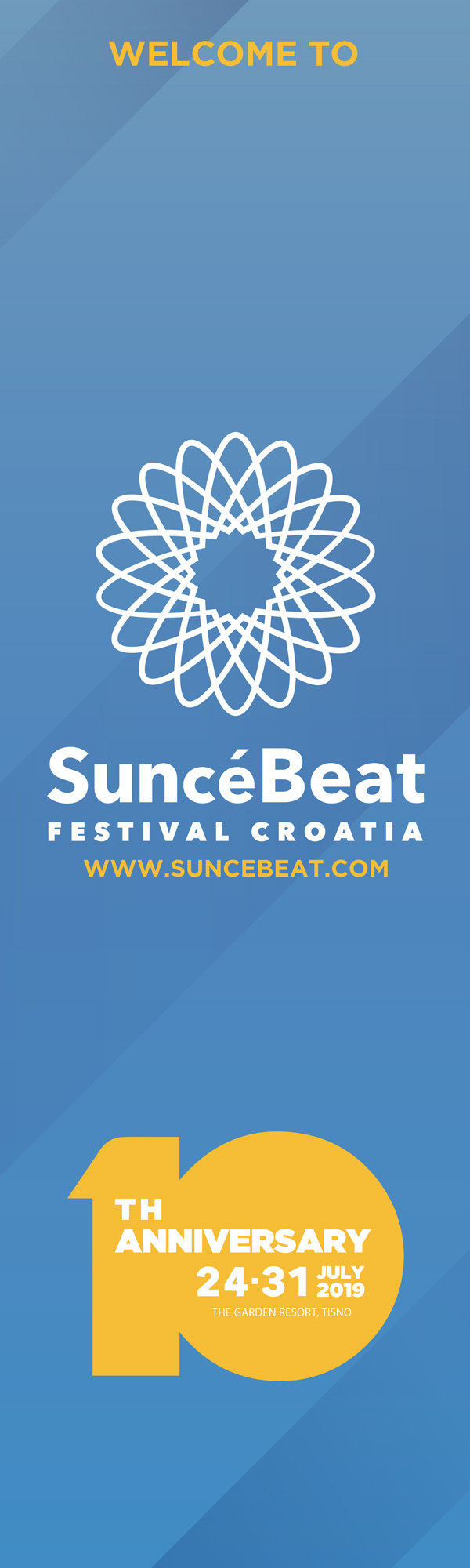
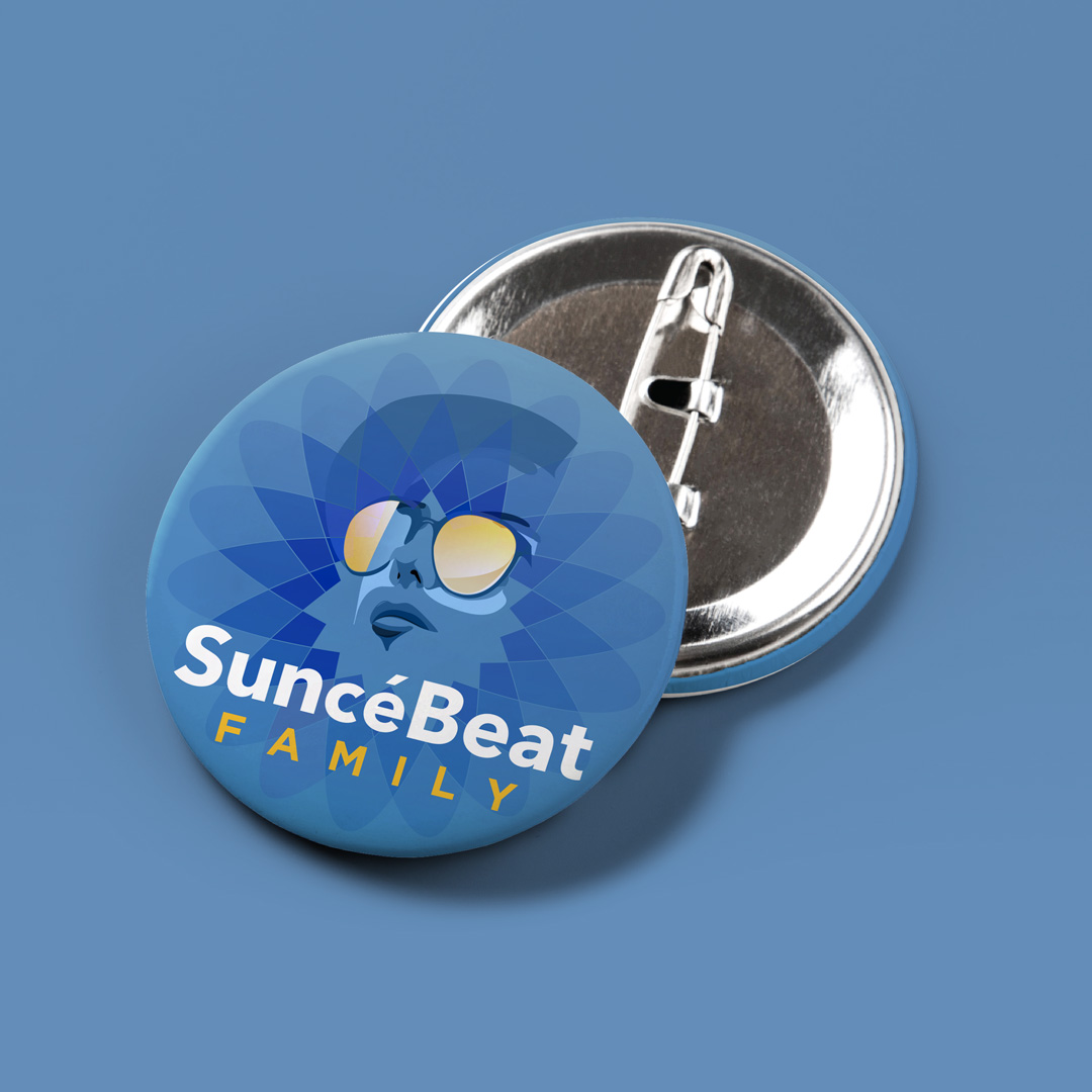
SuncéBeat 2019 was an interesting project to work on. Not only was there a lot more variation in the artwork to be created, but halfway through the client wanted to completely refresh the originally agreed upon colour palette. This meant the sunburst gradient that was used in all the upcoming promotional material was changed to a gold and sky blue colour palette for the festival itself. I was pleased I got to incorporate some of my own illustrations to the promotional material again though.
It taught me a lot about dealing with clients – you can only guide them so much and in the end they get the final say.
In the end it worked out for the better as the festival was celebrating its 10 year anniversary and was experimenting and trying new things with the brand. There was even a custom pilsner brewed specially for the event. It gave us a real time view of what worked and what didn’t, as well as how the brand itself was received by its audience.

