
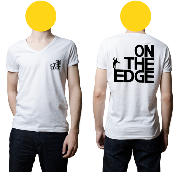
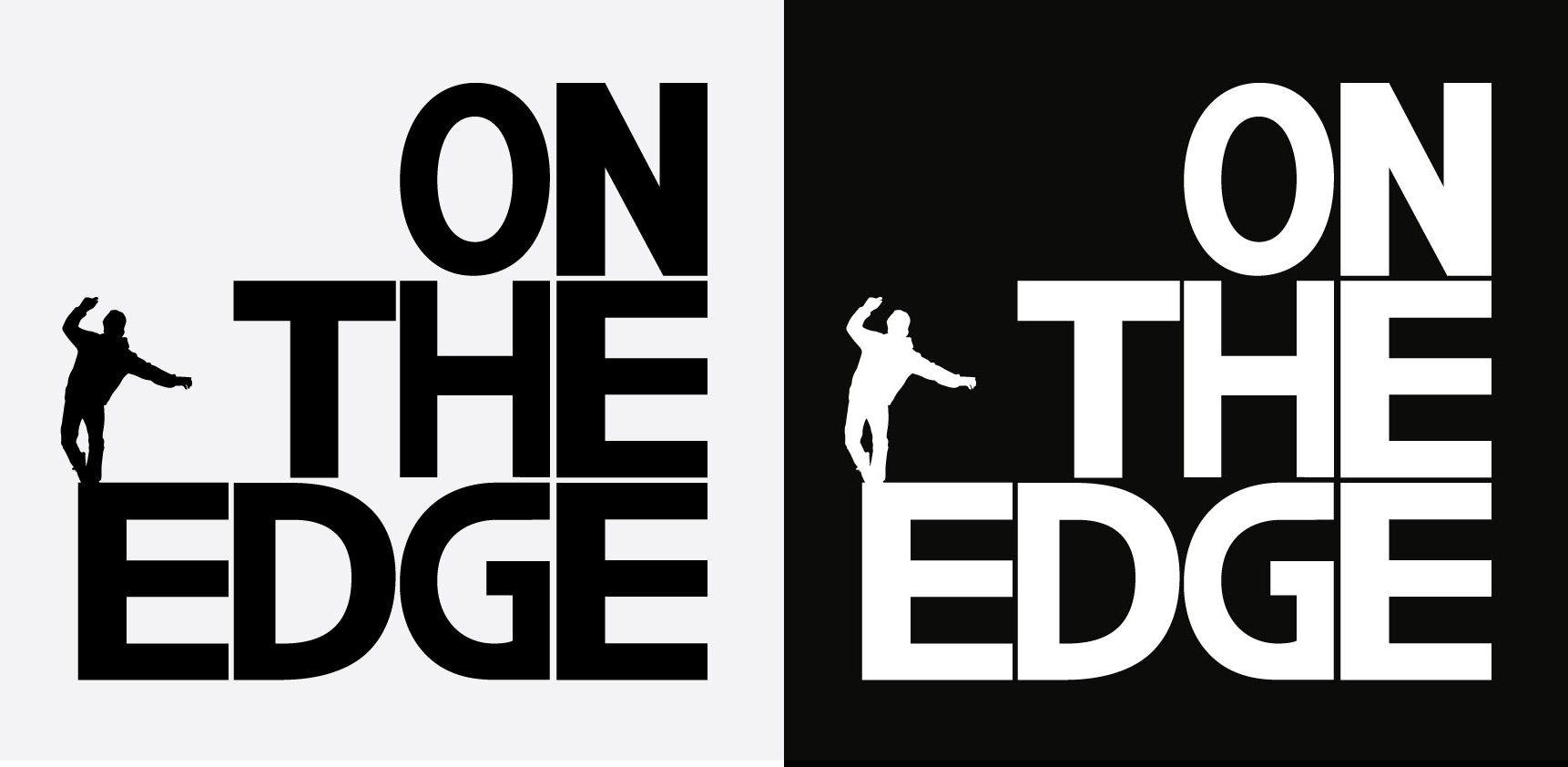
This brand was created for the social media marketing company On The Edge. The brand itself specialised in marketing for extreme sports professionals and the brand had to reflect those kinds of sports. This was done through the intensity of a bold, entirely uppercase font set with the text laid out forming a set of stairs, an obstacle used by many extreme sport enthusiasts. Each letter was manipulated to fit aesthetically into an invisible grid.
The name itself is also visualised by the individual walking the E like a tight rope.
Project
Brand Creation
Client
On the Edge
What We Did
Created a young, fresh, fashionable brand identity
- 0
- January 01, 2020
This brand was created for the social media marketing company On The Edge. The brand itself specialised in marketing for extreme sports professionals and the brand had to reflect those kinds of sports. This was done through the intensity of a bold, entirely uppercase font set with the text laid out forming a set of stairs, an obstacle used by many extreme sport enthusiasts. Each letter was manipulated to fit aesthetically into an invisible grid.
The name itself is also visualised by the individual walking the E like a tight rope.
Project
Brand Creation
Client
On the Edge
What We Did
Created a young, fresh, fashionable brand identity