
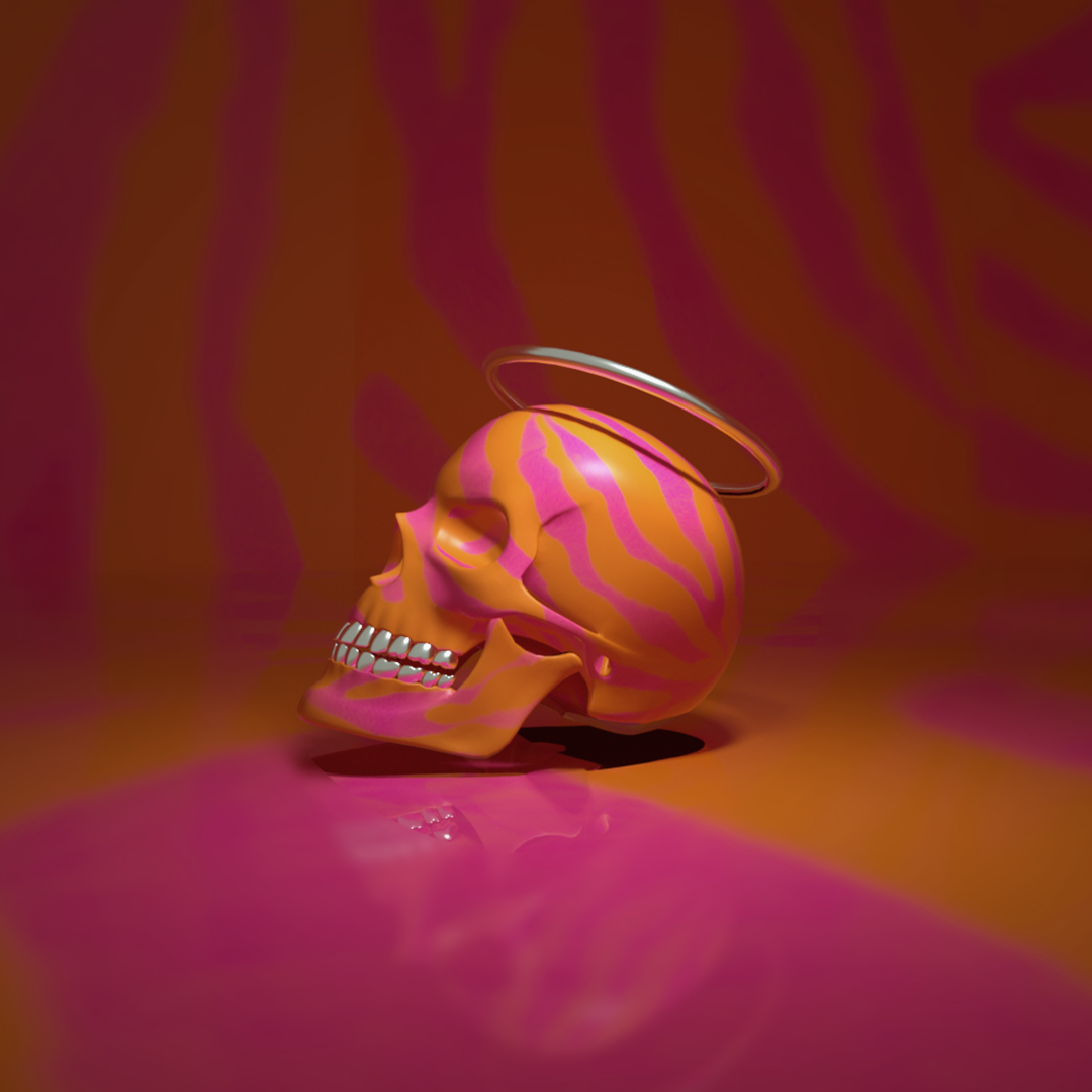
This was a personal exploration project to study various techniques in using an array of materials and textures to study their effects when applied in a digital 3D environment.
In 3D design, there is a sort of visual tension between light, material and texture and if one isn’t applied correctly it can throw off the others. With this in mind, physical textures were scanned in and rendered them in photoshop then applied directly to the object. Different parts were given varying levels of colour, reflectance, roughness, film index and transparency in order to study how each affected the other and where the perfect balance existed with each.
Another thing to take into account is when working in flat or 2-dimensional design the rule of colour is “less is more” ideally a palette of two to three colours is preferred. This is similar in 3-dimensional design however that rule is now affected by so many other factors like the ones listed above, you can find yourself getting overwhelmed. That’s why it’s always important to remember the acronym a university lecture once told me, K.I.S.S “Keep it simple stupid!”
Project
3D Material & Texture Study
Client
Concept/Personal Development
What We Did
Explore and develop techniques to optimise 3D project designs
- 0
- April 17, 2020
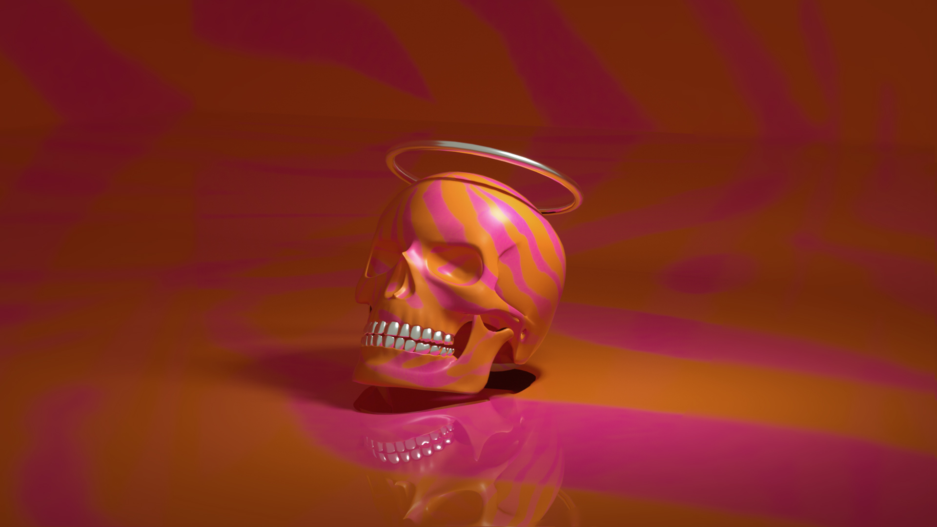
This was a personal exploration project to study various techniques in using an array of materials and textures to study their effects when applied in a digital 3D environment.
In 3D design, there is a sort of visual tension between light, material and texture and if one isn’t applied correctly it can throw off the others. With this in mind, physical textures were scanned in and rendered them in photoshop then applied directly to the object. Different parts were given varying levels of colour, reflectance, roughness, film index and transparency in order to study how each affected the other and where the perfect balance existed with each.
Another thing to take into account is when working in flat or 2-dimensional design the rule of colour is “less is more” ideally a palette of two to three colours is preferred. This is similar in 3-dimensional design however that rule is now affected by so many other factors like the ones listed above, you can find yourself getting overwhelmed. That’s why it’s always important to remember the acronym a university lecture once told me, K.I.S.S “Keep it simple stupid!”
Project
3D Material & Texture Study
Client
Concept/Personal Development
What We Did
Explore and develop techniques to optimise 3D project designs