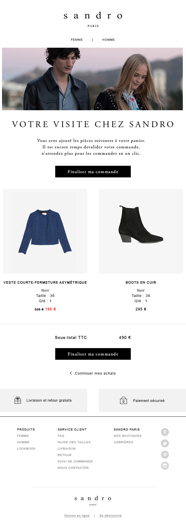
This onsite remarketing tool was created for the French clothing brand Sandro. I undertook this project while working for SaleCyle. The key aim was to create a design that captured the sleek, clean style that the brand is promoting.
One difficulty while designing for the brand, was that as the brand was French, all designs had to work in both French and English. This meant even more attention to detail was required to make sure it translated seamlessly.
Project
Email My Basket On-Site Remarketer
Client
Sandro
What We Did
Create a design that captured the sleek, clean style of Sandro
Desktop

Mobile


